Fidelity Investments
Giving financial advisors the modern tools they need to effectively help their clients in order to build trust, confidence and continue improving their client relationships

Concept for a new Wealthscape Investor sign in page
Overview
Fidelity Investments contracted DEPT in order to reimagine their brokerage platforms Wealthscape and Wealthscape Investor. The former is used by their financial advisory firms and the latter is used by the firm’s end clients.
Fidelity’s designers were too bogged down by daily tasks and shipping features so they needed us to come in and design the vision for the future of the products. Throughout the whole engagement we were embedded into their product teams and managed priorities that were defined by the Wealthscape platform leadership.
Date
01/2020 – 01/2022
My Role
Product Designer + Mobile Design Lead
Team


Testimonial
Yerri and DEPT were able to help us meet our goals and think differently about product development. Despite some internal alignment struggles and the current design system being a barrier at times we were able to innovate more than ever before.

Applying a new design system to an important and widely used feature
Impact
1) Introducing continuous innovation to the broader process
During our time with the team at Fidelity Investments we started by doing more conceptual work with the team. Once validating our concepts our role shifted to focus more on delivery.
With that shift we were able to show the Fidelity product teams that we could translate our concept to designs that are implementable too. We were able to quickly switch from development ready designs back to testable concepts and be able to make that switch depending on what the needs of the team are.
2) Alignment across platforms
Fidelity’s designers were usually allocated to a single part of the platform or to either Wealthscape or Wealthscape Investor.
There was rarely any crossover or knowledge sharing so just by having us work across different workstreams we became the connective tissue across web, mobile and across the 2 platform offerings. Many patterns we contributed became the norm and many teams benefitted from our contributions to the design system.
3) Delivering solutions to customer painpoints
When starting the engagement it took some negotiating with Fidelity to be able to talk to their clients. There wasn’t a set precedent to talking to advisor clients because any interaction with them would be facilitated by a Fidelity account manager.
The established process was that the account manager would field any feedback or requests then relay those to the product teams. As we gained trust we were able to get those unfiltered conversations with clients and be able to present concepts to them to get an accurate read on their appetite and excitement around the future vision.
Approach
Quickly showing results and building trust
We were brought into Fidelity to give focus to a long neglected feature set. Wealthscape and Wealthscape Investor weren't giving their users the right information at the right time. Every time time a user logged in they were surfaced generic and non-actionable information. The Wealthscape Team had lots of robust data that they were hiding under complex navigation.

The original homepage for Wealthscape and Wealthscape Investor
Aligning the sprint team towards a common goal
We started the engagement with Fidelity Investments with a 5 day design sprint. This helped us get up to speed quickly and get a better idea of the what the team wanted to accomplish. Below is an artifact from day 1 of the sprint along with the focus of the sprint.

Day 1 - Discovery Session
Getting the story right
After spending the first 3 days gaining context and exploring different concepts via sketching we ended Day 3 with a Storyboarding Workshop. This meant that the core sprint team members had time to voice their opinions and offer feedback as we made a complete story with the main actions we wanted user feedback on.

Day 3 - Storyboarding Workshop
Iterating based on user feedback
After wrapping up the 5 day design sprint we had many insights on what user's thought of the new homepage concepts. We also had the trust of the core sprint members since they saw first hand all of the painpoints and how much the improvements helped current users. With an additional week of designs we could address problem areas in the prototype and also do another pass with more realistic scenarios and content.

Comparison of the final prototypes at the end of week 1 and 2
Pushing our concepts and defining a system
After the 2 week engagement a longer contract was signed which allowed us too focus on different parts of the experience and allowed us to define what concepts would be translated into implementable designs. Pages like the login page weren't prioritized in the past so we took this opportunity to propose concepts on how to modernize these widely seen pages.

Old landing page vs vision concept
Proposing patterns that can scale across platforms
When making concepts for Wealthscape or Wealthscape Investor we proposed them across both platforms. We started to introduce ideas for theming to differentiate the platforms while using the same components.

Sign In Page Concepts for WS and WSI
Arriving to implementation-ready designs
Another effort was taking the ideas developed during the original 2 week engagement and working with the Fidelity design team in order to match up our designs to existing components in their design system. This meant collaborating across teams and working closely with the design system owner and engineers.

Day 1 of Sprint Whiteboard
Scaling our patterns and components
The bulk of our work was redesigning the homepage experience which meant our work was disconnected from modernizing other crucial parts of the platform. I was able to make connections with other teams that also wanted to modernize their features and was able to work with them to imagine what a refresh would look like. Below is what a reimagining of the account creation and onboarding flow could look like.

Account onboarding, funding and maintenance feature
Expanding and focusing on the investor persona
Another initiative that was prioritized was building out features that would improve the investor experience in Wealthscape Investor. The features we were exploring would benefit end investors while also helping advisory firms strengthen their relationships with their clients.

White-labeled Investor Experience
Customization out of the box
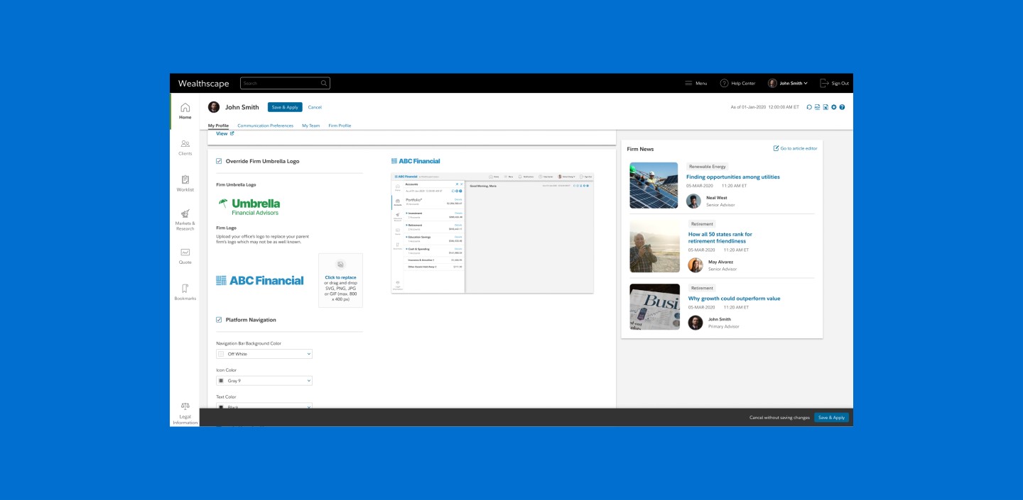
Financial advisors looking to build brand trust and confidence from their clients need a strong brand presence in the tools they give their clients. We wanted to make it easy for them to upload logos, change colors and have control over how their brand is portrayed.

Customize branding for your firm
Bringing our learnings to mobile
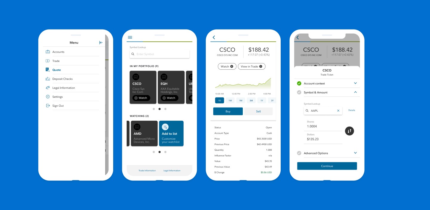
The last project that I focused on at Fidelity Investments was to take what we learned on the web platform and apply the same principles to the Fidelity mobile apps. This meant allowing users to perform actions on their account and not just view information which was the original capabilities of their MVP app. By the end of the project users would be able to Trade, View Quotes and Deposit Checks all from a new redesigned experience.

Trade screen concept
Leverage mobile patterns to surface information
For the quote feature we wanted to position this part of the app to be used for research and connecting it to something actionable. A user could save stocks they're interested in and then when they're ready they can Buy or Sell. We took advantage of bottom sheets and visualizations in order to make the best out of less screen real estate.

Quote and Trade Ticket in context
Streamlining a process that's used daily
Remote check deposit was a feature that was widely requested to be included in the mobile app. Many users used the feature many times a day so keeping it simple and intuitive was a high priority. Minimizing errors and false submissions were the biggest improvements to the process and this saved Fidelity Investments hundreds of thousands of dollars since each call to the check recognition API cost 25 cents.

Day 1 of Sprint Whiteboard
My Contributions
Driving projects and features forward
Alongside Steve Hickey we would start each week by delegating tasks on projects we were working on together while also leading initiatives that were independent of each other.
This meant that there was deep collaboration on projects that were related but I was also able to collaborate as a lead designer on projects with separate product teams. The separate projects would be more delivery focused and meant shipping features often.
Building relationships and socializing information
As an agency consultant the first few months are crucial to setting norms and knowing what are the challenges and goals of each team member are. I was able to build connections across teams and align team members on a path forward.
Having regular conversations with designers, product leads and other project stakeholders allowed me to build connections and to relay information to align us all to a singular vision.
Leading the progress on the mobile app MVP
The last initiative that I led centered around taking over the design of the Wealthscape Investor app and to continue introducing features that are available on the web platform.
This work included contributing patterns and components to the design system in order to support the new feature work. It also included implementing remote check deposit to the app because it was the most valuable and most requested feature for the MVP release of the app.
Learnings
Prioritize relationships
At Fidelity there were several direct and indirect stakeholders on the project. Sometimes there was lack of alignment across teams which led to disagreements across leads. Being able to help the team gain a consensus proved to be a valuable skill and helped us be effective and make decisions in a timely manner.
Work under constraints
With Wealthscape being a B2B2C platform that is aimed towards financial advisory firms and their end clients we needed to see things through a constrained lens. For example weighing working on features aimed for advisors vs their clients and how much is still left to the advisor to facilitate vs technology.
Another constraint was dealing with a large amount of legacy code and features. Features that were developed over 20 years ago meant that we were undoing a lot of previously made decisions and justifying why we were proposing allocating time and money to modernize the platform.
Set a solid foundation
Since starting on the conceptual/future facing work that meant reimagining the home of Wealthscape we knew that it would be a journey of 1,000 steps. We weren’t going to undo years of untouched legacy code and undo decisions that brought the Wealthscape team to this point.
We knew that success would mean small wins and making sure that every decision we made would be scalable and modular for more changes in the future. Every contribution to the design system, piece of documentation and vision prototype would be a tool to be built upon until every part of Wealthscape was revamped.
